Showcase Cinema De Lux
Showcase Cinema De Lux: A Redesign of the webpage booking process.
The redesign of the booking service would help simplify the booking process for users and enhance user experience.
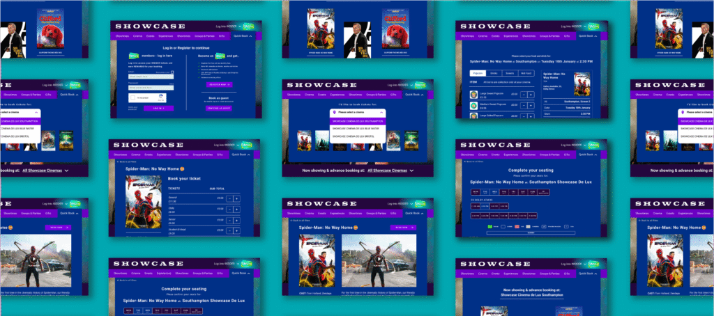
This UX/UI university project focused on redesigning the desktop ticket booking journey for Showcase Cinema De Lux. The goal was to reduce friction in the flow, increase visibility of key revenue-driving features such as Insider membership, and improve overall usability.
As the UX/UI designer, I led research, usability testing, wireframing and high-fidelity prototyping in Figma. The result was a streamlined, research-led booking experience that significantly improved user satisfaction.
The challenge
Usability testing revealed clear friction points within the existing booking journey.
The Insider membership programme — a key loyalty driver — was buried low on the page, making it easy to miss. Critical call-to-action buttons appeared below the fold, interrupting flow and increasing hesitation.
Most notably, users could not change their screening time without restarting the booking process entirely, creating unnecessary frustration and potential drop-off.
Initial experience ratings averaged 3/5, highlighting a clear opportunity to simplify the journey and improve conversion-focused design elements.
The solution
The redesign focused on clarity, visibility, and flow continuity.
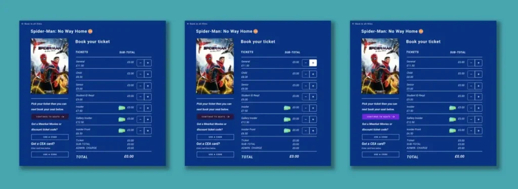
Insider membership was repositioned higher within the journey to improve discoverability and support sign-ups. Call-to-action buttons were restructured and placed at logical progression points to reduce cognitive load and create clearer next steps.
The booking flow was redesigned to allow users to change dates and times without restarting the process, removing a major usability barrier.
Visually, the interface was refined with improved hierarchy, clearer ticket selection layouts, consistent UI components, and a structured style guide aligned with the Showcase brand.
The outcome
Post-redesign testing showed a significant improvement in user experience.
Participants described the new flow as clearer, smoother, and more intuitive. The ability to adjust screening times and the improved visibility of key features were highlighted as major improvements.
Overall satisfaction increased from 3/5 to 5/5 following usability testing.
This project demonstrates how strategic UX decisions — particularly around hierarchy, CTA placement, and task continuity — can directly impact user confidence and perceived efficiency.